Think you know brand logos? Then these might surprise you!
Did you know Lyle’s Golden Syrup holds the Guinness World Record for having the world’s oldest unchanged branding and packaging? Well, last week they finally decided to ‘refresh the brand’s legacy to appeal to a 21st century audience’. And given their original logo featured a rotting lion surrounded with bees, it’s a bit surprising it didn’t happen sooner!
The reason why the logo was so grim was Abram Lyle the company’s founder was inspired by the Old Testament story about Samson who kills a lion only to discover honeybees have built a hive in the animal’s carcass. He then presents the honey to some wedding guests with the riddle “Out of the eater came something to eat; out of the strong came something sweet.” Lyle then tweaked this wording to ‘Out of the strong came forth sweetness’ and made it part of the logo.
Inevitably, there has been some backlash to the refresh, but what surprises us most is how many people didn’t know the logo featured a dead lion! Which got us thinking – which other brand logos hold a few surprises.
The Fatal Attraction of Versace
In case you didn’t realise it, the Versace logo features the head of Medusa, the Greek mythological figure. Most people associate Medusa with turning people into stone, but Versace chose the motif for another reason – ‘whoever falls in love with Medusa can’t flee her’. Which when you then think about it is pretty creepy!
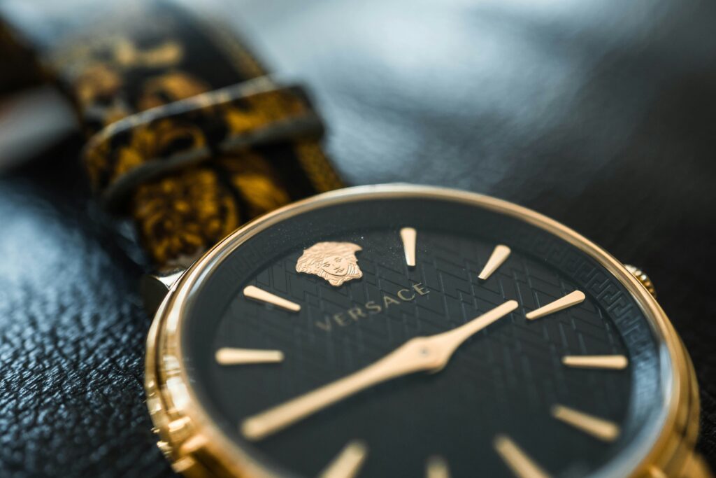
But to be fair, Versace definitely embraces the symbolism of their logo. Known for their sumptuous fabrics, imaginative patterns and bold choice of colour, their designs create feelings of both desire and fear at the same time. Pretty much what Medusa did!
A siren calls you to Starbucks
Did you know Starbucks is named after a character in Herman Melville’s epic seafaring adventure, Moby Dick? Or that the logo is a Twin Tailed Siren from Greek mythology famed for using her beauty and melodious music to lure sailors to their death?
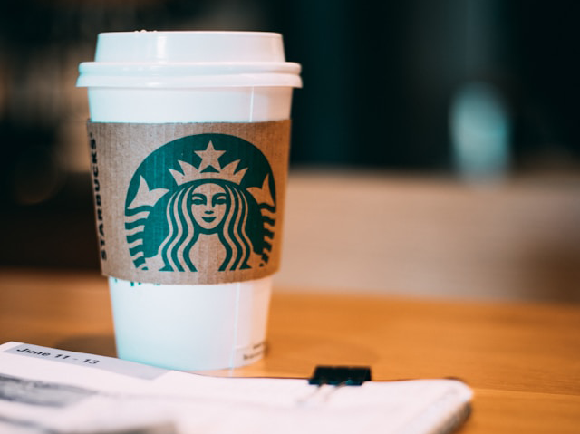
In 2011, the designer, Terry Heckler, told The Seattle Times, ‘it’s a metaphor for the allure of caffeine, the sirens who drew sailors into the rocks ‘. An iconic logo which nicely encapsulates Starbucks’s brand purpose of creating great coffee from around the world but can’t say we’re too keen on the whole death analogy!
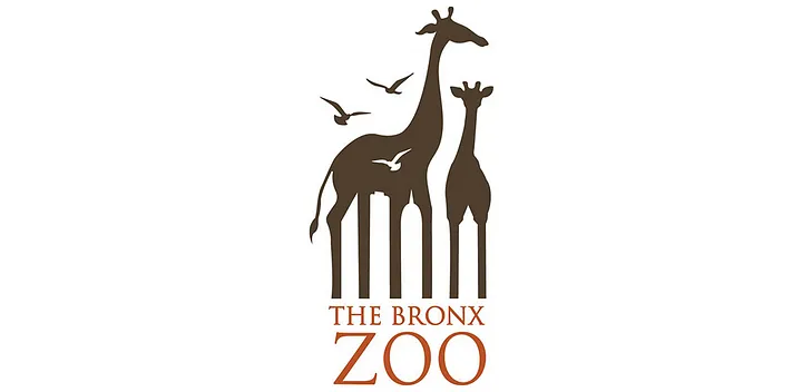
Fancy a trip to Bronx Zoo?
The Bronx Zoo logo might not be particularly familiar to people in the UK, but you’ve got to admit it’s clever.
At first glance it’s just a pair of giraffes and some birds. But look again, and you will see New York’s skyline under the legs of the giraffe. Genius!
Or to the Museum of London?
A bit closer to home the Museum of London logo is certainly colourful.
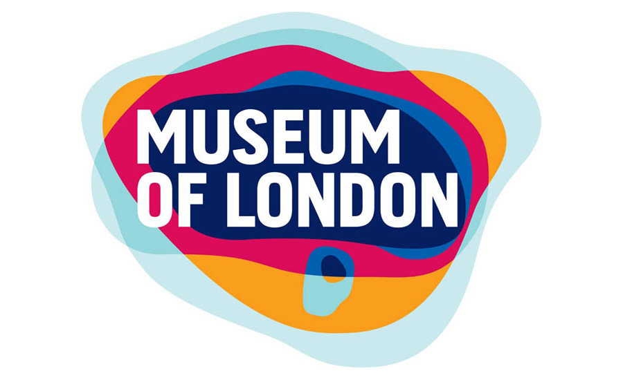
Launched in 2008 as part of a rebranding exercise, the different colours of the logo reflect the ever-changing boundaries of London throughout its history starting with Roman London and finishing with what the future could be. Oh, and the typeface echoes the city’s iconic street signage.
Or to Pittsburgh Zoo?
What do you see? A tree or a lion and gorilla looking at each other? You decide.
![]()
Who would Toyota it?
Who else thought the Toyota logo was just a random collection of shapes? Turns out there is a lot more to it.
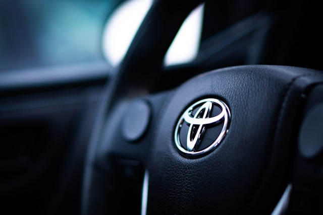
For one thing if you look carefully and you will see the logo contains all the letters in the name Toyota, and as well as the two ovals inside the outer oval representing the T, they also symbolise the steering wheel within the vehicle. The outer oval meanwhile symbolises the world that embraces Toyota. And, if that wasn’t enough, each oval is a different thickness to reflect brush art in Japanese culture.
This logo was released in 1989 to commemorate the 50th anniversary of the company and you won’t be surprised to learn it was 5 years in the making!
Bridging the gap with Cisco
You wouldn’t guess it from the latest iteration of the Cisco logo, but the lines don’t just represent electromagnetic waves but also the Golden Gate Bridge in San Francisco. Why? Because the founders were inspired by it as they drove into the city to register their company.
How many ice-cream flavours?
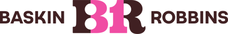
You have got to love a bit of subliminal messaging! Baskin Robbins has cleverly hidden the number 31 in their logo to show they offer a different flavour for every day of the month.
While that’s no longer accurate, as they now have over 1,000 flavours, when they first launched in 1945 this was a bit of a selling point, so much so ’31 flavors’ became their well-known slogan.
Mom’s home-cooking at Wendy’s
And talking about subliminal messaging what about the logo for Wendy’s? Featuring the founder’s daughter as an 8-year-old, if you look carefully, you can see the word “Mom” in Wendy’s collar. A subtle message maybe that Wendy’s is all about wholesome, home-cooking, just like Mom’s?
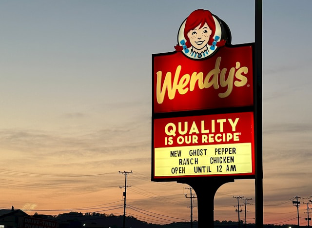
The design agency who created the logo say it was unintentional. We’re not so sure!
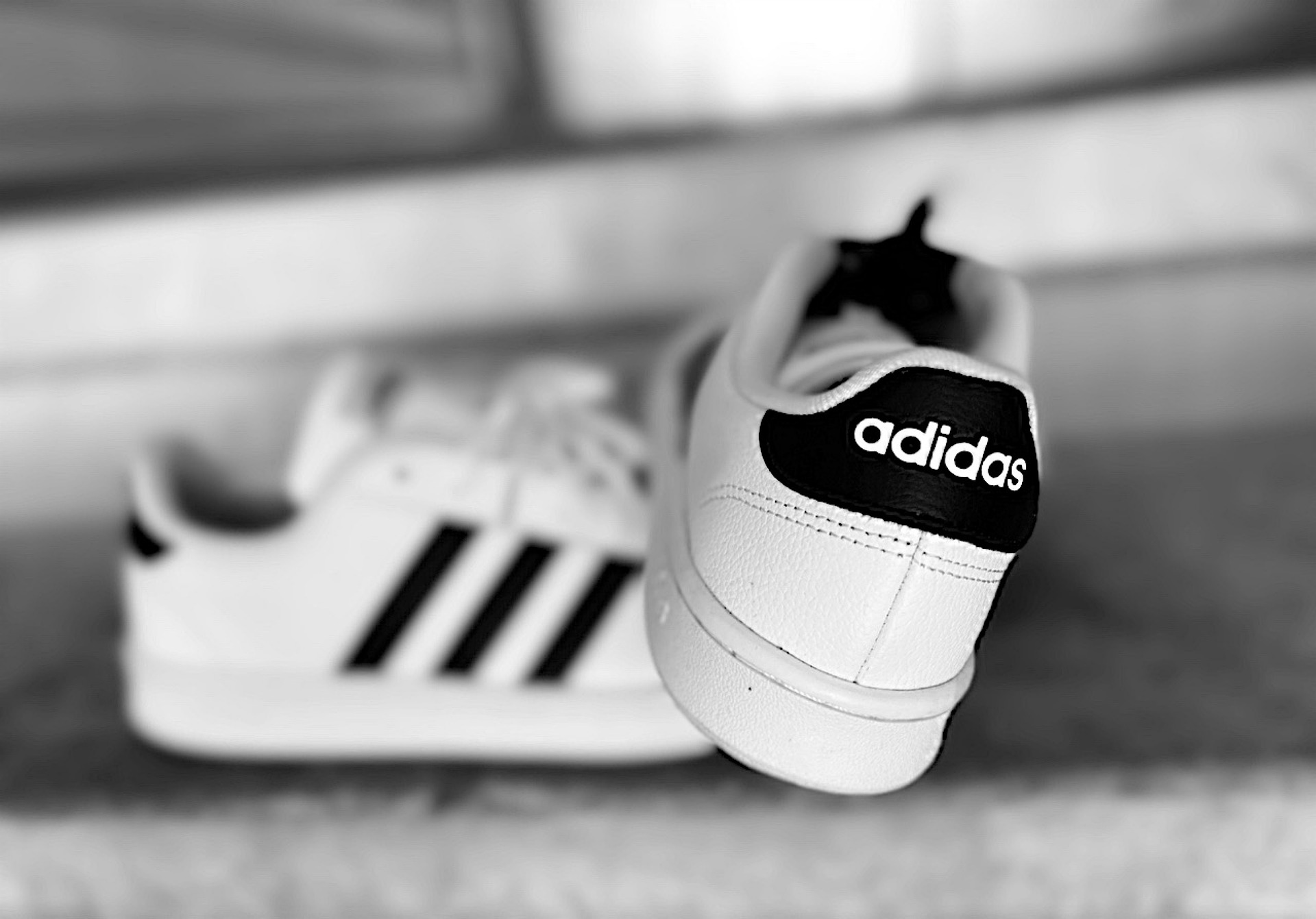
Climb every mountain with Adidas
The Adidas logo is one of the most recognisable ones in the world, but have you ever thought about what the three stripes actually mean? Well, it turns out they represent a mountain, and all the challenges and goals people need to overcome.
![]()
Need help creating your own logo?
It’s fascinating to learn how much thought has gone into creating these brand logos, and in some ways it’s a bit of a shame that more people don’t appreciate their true meaning, although is some cases, maybe it’s better that way!
If you’re interested in creating a logo which really encapsulates your brand, just get in touch and we’ll be more than happy to help.